A Website With Warm Natural Textures
As the redesign of the Heritage Hotel – Lancaster website began, the property was in the process of a fairly substantial renovation. Meeting and event rooms, public areas, and the hotel rooms themselves were getting a facelift, and the goal was to bring this fresh look to the website.
Loxley's Restaurant, located at the hotel already featured an earthy decor, using wood and stone textures throughout. A similar feel was being introduced to the rest of the property. It was decided that this would be a nice approach to take with the website redesign as well.
Warm natural tones of wood, stone and fiber were used to tie the physical location to the online brand.
Project Highlights
-

Easy to Manage Menu
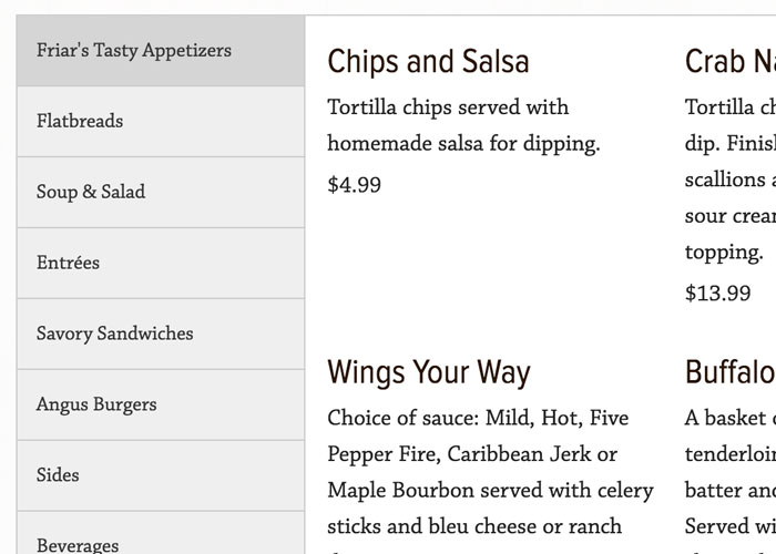
Loxley's Restaurant is one of the most popular sections on the website, and visitors want to see what is available on their menu. The site allows the restaurant to easily update the items on the menu, keeping the items and pricing up-to-date.
-

Cross Promotion
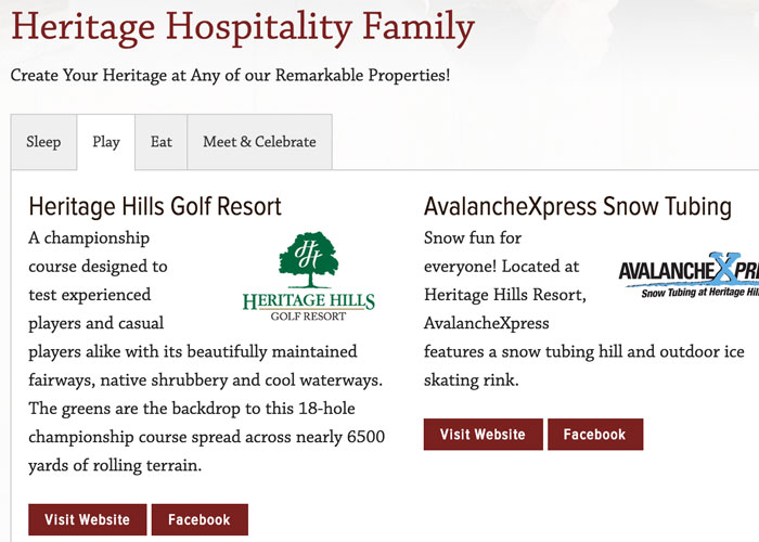
Heritage Hospitalities features a wide range of properties in their portfolio. This site allows the hotel to easily add properties and place them in the proper category, giving the visitor an idea of other venues they may wish to visit.
-

Design Mimics Real Life
Visitors to the website are introduced to the brand right away, through the use of natural textures and tones that are present on site. This will resonate with customers.
Does your website properly reflect your brand? - Let Us Help